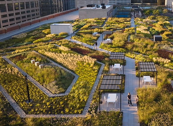
.webp?language=en-US)
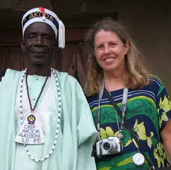
Suzanne Blier
on Open Source GIS
WorldMap is an open source GIS tool that enables anyone anywhere in the world to create their own maps and overlay them with data for free. Why did Harvard create this?
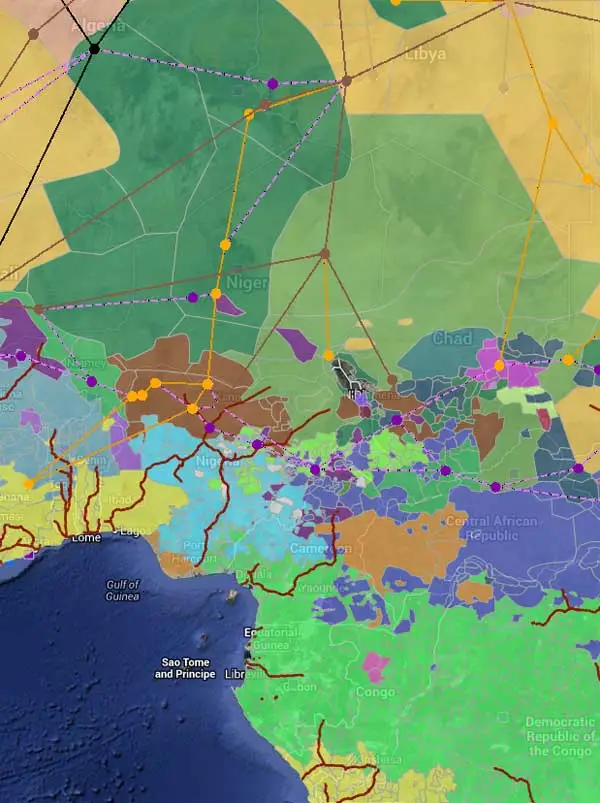
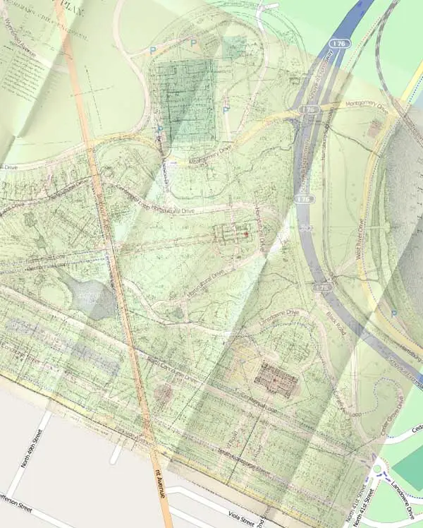
GIS has been transformed in the last 20 years. I was using it in a project when I moved up to Harvard from Columbia in the early 1990s. I received some outside funding to put together a GIS mapping system of Africa. When that project came to a conclusion, I applied for some additional funding for innovative computing. At that time, Harvard had established a new Center for Geographic Analysis. They hired a really brilliant young GIS scientist named Ben Lewis, who is a graduate of University of Pennsylvania's program in urban planning. It was his belief that one could actually put together a system, making it available to everyone using open source technology. This is what became WorldMap.
We began with Africa. The idea was to bring together the best available mapping anywhere in a format that would allow us to overlay different kinds of data. Soon, other people around Harvard began to look at it. From the sociology to the geology to the history departments, other scholars said, “we’d love to do that as well." And there was serendipity: this was the first large project at the Center for Geographic Analysis. There, lots of people contributed ideas.
Why not just use Google maps engine or ArcGIS?
You can go into WorldMap, create a project there, and upload it to Google Earth. We do bring in Google mapping and other mapping data. The two are not at odds in that way but you can do more with WorldMap. For example, if you are creating a project in Google Earth, you can’t bring in other mapping data and then share with others as you can in WorldMap. With our site, you can bring in your own historic mapping data. You can bring in text, images, or video. With the system one is encouraged to draw on any available mapping resources to build one's own. You can also create and visualize things as you want in your own way, give them your own look, and have your own data symbolized and presented as you like.
ArcGIS is a terrific product. It's still very effective, used by many, as well it should be. As you probably know, it’s very complex to learn. I’ve approached how many undergrads and grad students, trying to convince them that it’s worth the time spent to do it. But it's still like climbing up a cliff with a bicycle. There are cost factors, too, for people using ArcGIS. Granted, you can use it in part online now, but we didn’t think there was the same kind of potential for bringing in your own data, historic maps, sociological data into the system, then being able to share it with other people in the same kinds of ways. We’re collaborating with ESRI, too. There’s plenty of room for both kinds of products. Each of them offers something slightly different.
In some ways, WorldMap can be more easily grasped by the less technically astute among us, whether a landscape architect, planner, historian, or student. I also really love the way we can share our projects with people anywhere in the world.
I’ve seen map makers on WorldMap already overlaying river systems, poverty rates, ethnic groups, and then showing how these have changed over time. What other types of layers are people using? What are the most popular mash-ups?
We should be hungry to learn not just from what our own individual disciplines are offering, but from what everybody else is doing. This technology allows one to do that. So sociologists are bringing in different kinds of data than we might be, a lot of demographic data, information on transportation systems, neighborhoods, etc. Landscape architects and urban planners offer new data on some environmental questions, ecosystems, and city plans.
You can go through all of the different layers people have brought in and see what are the most popular. These tend to be environmental -- river systems like you mentioned -- and ecosystems, but also transportation, railroads, etc. A number of projects have taken up historical data we brought in from Euro Atlas, which shows the history of Europe going back to the earliest period. And because WorldMap users are generally happy sharing their data, there is a lot to chose from. Almost 90-95 percent of the map data can be used by anyone.
You can bring those layers into your own layers. It’s a little bit like Wikipedia in this sense. You can build your own map in part out of what other people put together, but done in new ways that suit your research interests.
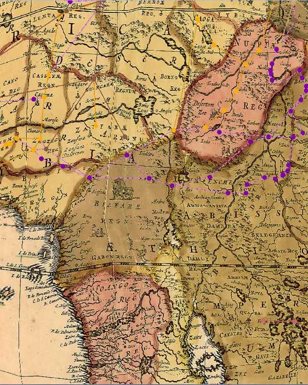
You mentioned AfricaMap, your project that then created this larger World Map. In AfricaMap, users can overlay religions and ethnic groups. They can see areas where there’s high population density. They can use the map to imagine transatlantic trade routes. There are historical maps, which I really love, dating back to 1606, which seem to magically appear over the baseline Google maps. How is this powerful tool being used? Is it being used in ways you didn’t expect?
I’m also fascinated with the seeming magic of taking early maps and laying them on top of current ones. One the most fabulous additions in the development of the system was when we created our map warper or map rectifier. This means you can take any historical map or any map, whether it’s of the world, a continent, a country, a city, a neighborhood, a street corner, and very quickly add three or four points -- more if it’s a very historic map, because of discrepancies. You can then co-join the lat-longs and bring this map into your own mapping system.
You can also take a map or plan that may be poorly done or is under copyright, but you’re really interested in the data. Well, we’ve also provided the means so that you can in essence use WorldMap like tracing paper. You can basically copy it by adding lines, points, and shapes on top of it, stylize it in new ways, and create your own particular manifestation of that plan.
Some interesting work is being done within or on the perimeters of a new project in WorldMap called TweetMap. This project in WorldMap has been used to harvest all of the geo-referenced data in Twitter. You can do a search within that. You can frame it by time or a particular area for any term or phrase you might want. That could be really useful for thinking through perceptions of the city.
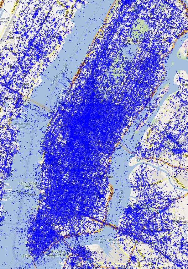
Twitter Map was developed originally by Todd Mostak, a student in Middle Eastern studies, and the Kennedy School here. He was interested in the Arab Spring and locating how that was being framed in Twitter.
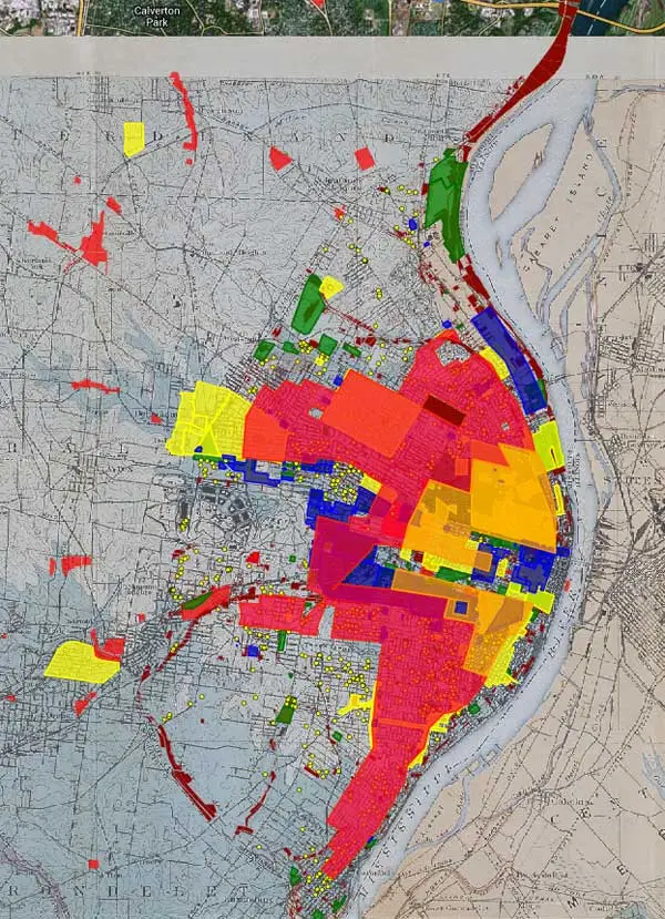
Another fascinating map by Professor Colin Gordon, University of Iowa, maps decline in St. Louis, showing how blight took over parts of the city. The map tells a powerful visual story of blight and then redevelopment. What kind of urban stories are you also seeing told? What else could this tool be used for in terms of urban policy, advocacy, or even design?
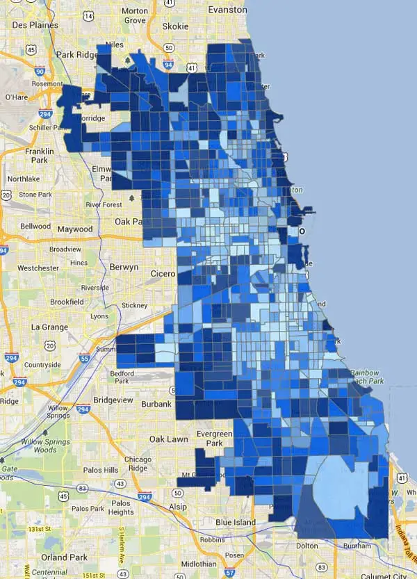
His project is a fascinating one. There’s a corollary in Chicago, another important map in WorldMap by another sociologist named Robert Sampson. One important thing with both Professor Gordon’s and Professor Sampson’s projects is they’ve actually integrated their WorldMap projects into books that they’ve recently published.
A graduate student here is using WorldMap to analyze New Orleans, thinking through the early history of the city where the slave markets were, how the concept of neighborhoods were changing in the city from the early Spanish and French periods to the later American period. You can even correlate that with building design changes.
I’ve been fascinated with the impact of World’s Fairs on cities so I’ve put up a series of World Fair plans, whether it’s St. Louis, San Francisco, Chicago, Brussels, or New York City. You soon realize how important some of these World’s Fairs were in terms of the changing dynamic of the city. That brings in plans from great landscape architects such as Frederick Law Olmsted.
We also have a plan up of the 1876 World's Fair in Philadelphia. Of course, as you know, some of the World Fair buildings are still standing. You can overlay on top of this not just the plan of the fair, but also the plans of the landscapes and buildings at the fair. You can then embed into this project photographs taken at the fair. Within WorldMap, you can link directly to photographs and add points by creating particular symbolic icons so that once you click on them, you’ll be able see was the view in 1876 or whenever.
Landscape architects, planners, and other design professionals could really use WorldMap to both root designs in local social and economic contexts and even histories. These maps could also be used to create compelling presentations of different design alternatives. How do you think designers should be using WorldMap? What features do you think would be most useful for them?
There’s some terrific work being done by Europeans using WorldMap to evaluate economic disparities in European cities. There’s one on Athens. There’s another fabulous set on Barcelona. One of the great things about World Map is you can actually make it a collaborative project -- not just for landscape architects per se, but also for the people who are living in and with these landscapes. You can bring in the informal. We have provided people in these communities with the tools to upload their own data, let’s say their own experiences in a landscape through text, video, or photographs. That could be a really positive addition to landscape architecture preservation, and help outline the importance of these places as lived space.
You can use this tool to promote the importance of landscape architecture in school systems, from K to 12, getting teachers and students to use this to upload information about their own experiences with their landscape and help to preserve them at the same time -- to not just preserve them historically, but also to become caretakers for these spaces. You could compare the area of X plot of land versus Y plot of land or distances or simply add cell phone and other imagery of a particular landscape.
We are increasingly thinking about pooling resources in documenting the works of key individuals, whether it’s Frederick Law Olmsted or Frank Lloyd Wright. People who use these parks or live in these structures can create a project on WorldMap, with people in different locations adding information. One can make these maps available on the site to the world -- and really use these people to do some of the more labor intensive and expensive work of geo-referencing plans -- is a great idea.
Lastly, are you worried that people will misuse these maps, display false data to build specious cases? If data can be manipulated, is there any truth in maps?
Well, personally, I would love to see the creation of fictional maps, imaginary places based on real places. That’s the positive side. Another positive side is that we now have a tool to evaluate maps, meaning that we are providing a means for users of WorldMap to tag maps and identify those that are really well done versus those that are problematic. That’s the open source nature of it.
We don’t have enough staff to go through and evaluate maps, nor is it something we want to do. We would rather keep this as a toolbox available to everyone and rely on people who are using these maps to let us know if there’s something that is indeed really problematic.
Maps are things that have this necessary complexity. There will always be disagreements on borders, for example, now between China and India. At WorldMap, we’re perfectly happy to have a Chinese and an Indian version and various ones in between. Some of these disagreements are enriched or complicated by the possibility of creating competing maps.
In the same way that river systems notoriously change over time, which is why you shouldn’t geo-reference from them, these kinds of discrepancies are great within a system.
It's far easier to create or change something in WorldMap than in a printed book. WorldMap allows for more creative approaches and different opinions in map making.
Suzanne Blier is Allen Whitehill Clowes Professor of Fine Arts and of African and African American Studies at Harvard University. She is an historian of African art and architecture in both the History of Art and Architecture and African and African American Studies Departments. She also is a member of the Institute for Quantitative Social Science. She is Co-Chair of an Electronic Geo-Spatial Database AfricaMap, a site that expanded into WorldMap.
Interview conducted by Jared Green.